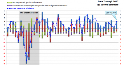
Visualizing GDP: An Inside Look At The Q2 Second Estimate
Note: The charts in this commentary have been updated to include the Q2 2017 Second Estimate released yesterday. The chart below is a way to visualize real GDP change since 2007. It uses a stacked column chart to segment the four major components of GDP with a dashed line overlay to show the sum of the…


