The new Z.1 report came out today so let's update many of the indicators I've been sharing here over the past few months. What should be worrisome to market watchers here is that we now have a host of significant indicators that look like they may have formed important peaks and begun to roll over. We will need to see at least a couple more quarters worth of data to be sure but this is certainly something to keep an eye on.
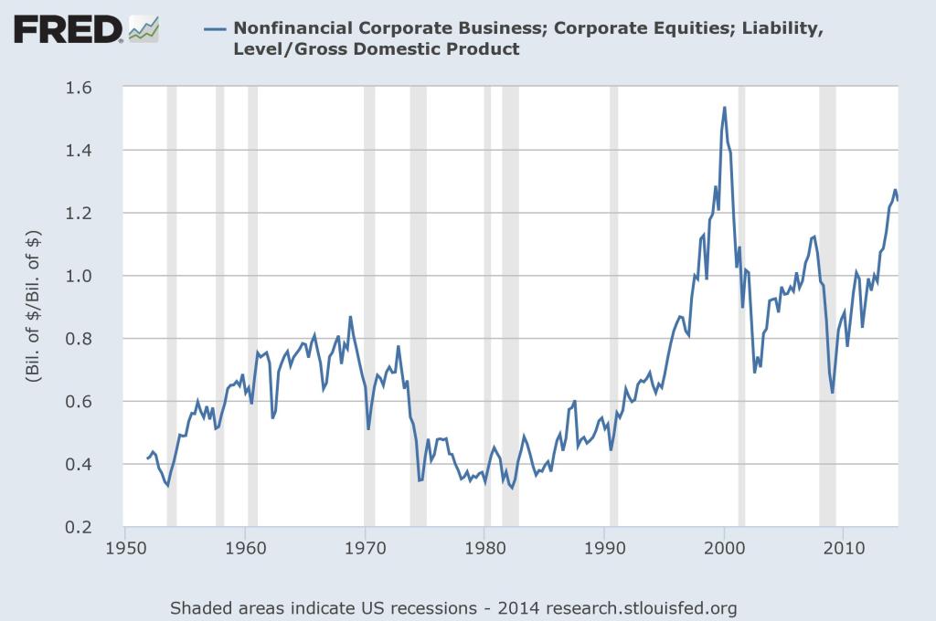
First let's take a peek at Warren Buffett's favorite valuation yardstick. (See “How To Time The Market Like Warren Buffett” for a look at one way I use this indicator.) It actually peaked last quarter and saw a small retracement in Q3. This indicator is 83% negatively correlated with future 10-year returns in stocks (the higher the reading the lower forward returns) and its current reading implies a -0.88% annual rate of return over the coming decade. The 10-year treasury at 2.2% looks fairly attractive in comparison.

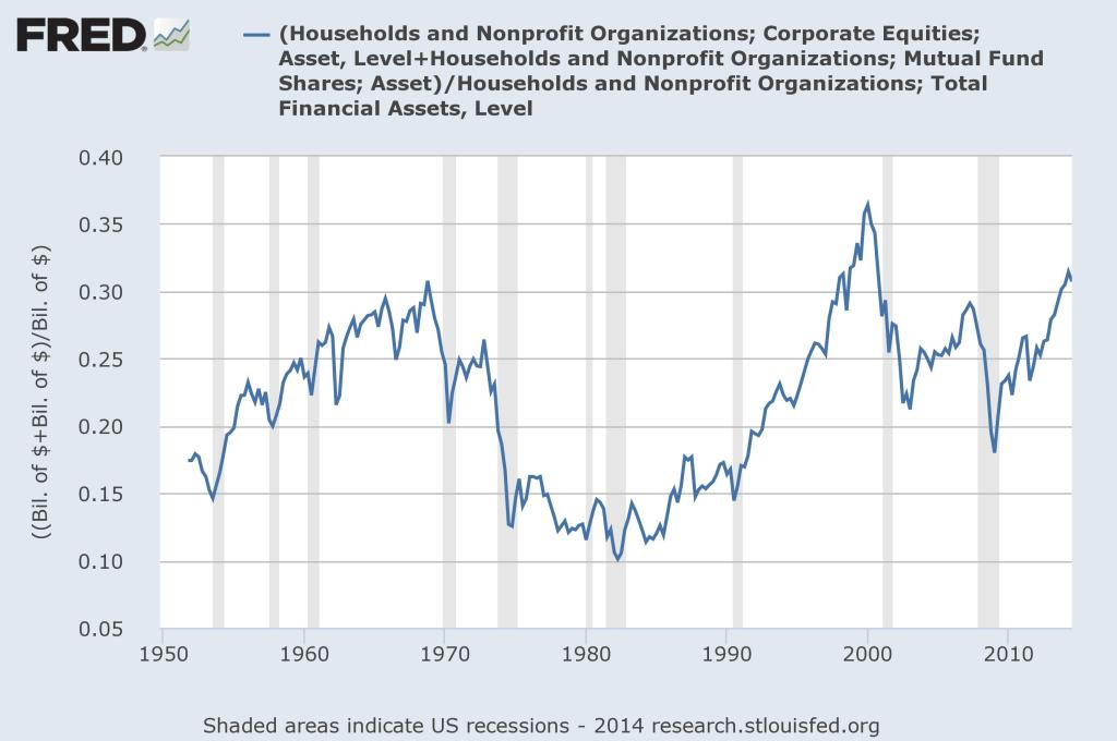
Next we can take a look at the household percentage of financial assets allocated to equities. This indicator is even more negatively correlated to future 10-year returns at about 90%. It has also pulled back just a bit from the peak it made in Q2. Its current reading implies a forward return of about 2.8% per year over the coming decade, slightly better than the 10-year treasury.

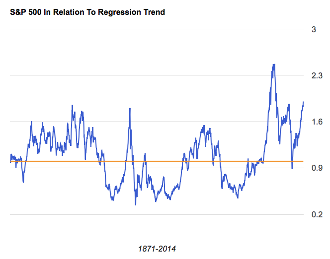
Finally, comparing the current level of the S&P 500 to its long-term regression trend we can see that the only other time in history stocks were this overbought was at the height of the internet bubble. This measure is not quite as highly correlated to future returns as the other two but at 74% it not that bad, either. It also looks at the largest data sample of any of them so I believe it's worth including. At its current reading it suggests stocks should return just 0.74% per year over the coming decade.

Blending the three forecasts together we get a 0.89% annual return forecast for the stock market over the coming decade. A straight comparison to 10-year treasuries at 2.2% shows them to be the more attractive of the two asset classes right now. Hell, even 5-year treasuries are paying 1.6%, nearly double our model's forecast.* All in all, this looks to be the second worst time to own equities in history.


