In recent months we have seen a dramatic spike in visualizations by sellside analysts, who appear to have finally grasped the reflexive nature of markets first noted so many years ago by none other than George Soros, which – with the Fed involved in all of them – show just why Janet Yellen is trapped.
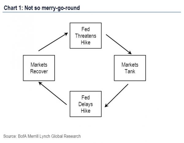
First, it was Bank of America who in early may sketched the not-so-merry-go-round framing the relationship between the Fed and the market as follows (for our commentary read here):

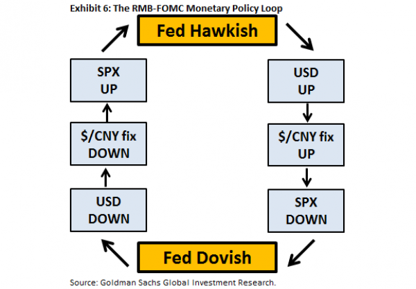
Then just a few weeks later, when Goldman soured on China and the Yuan, the vampire squid revealed the Fed-China “doom loop” showing the Catch 22 relationship between the USD and the Yuan and how the S&P500 works as an intermediate buffer between the two.

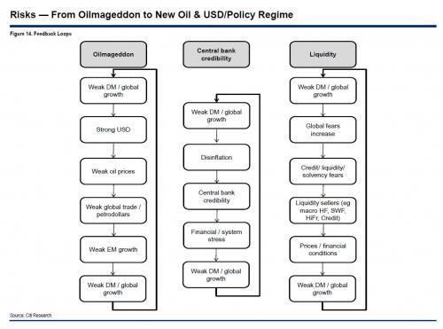
Now it is Citi's turn to unveil its own charting artistry with the following chart summarizing what it sees as the 3 big feedback loop risks as the world enters the “volatile” phase of the centrally-planned market and global economy. Presented without commentary.


