One of the things I note from time to time in my discussions of wage growth is how much its fluctuation in real terms has been affected by gas prices. For example, in the middle of the worst recession in nearly 70 years, real wages actually went up! Why? Because gas prices fell from $4.25/gallon to $1.50/gallon in just a few months.
So, what would a long-term view of real wages look like if I took out the whipsawing effect of gas prices?
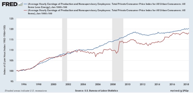
In the 25 years from 1970 to 1995, what you mainly find is that the huge increase in the new supply of potential workers (women) acted to depress wages, so the below graphs start in 1995. In the first, I've normed the level of both real wages in total (red) and real wages ex-gas prices (energy) (blue) to 100:

You can see how much the secular rise in gas prices from $0.80/gallon in 1998 to $4.25/gallon in 2008 depressed real wage growth; and similarly how the collapse from nearly $4/gallon to $1.70/gallon in 2014-16 helped it.
More importantly, notice that real wages adjusting for gas prices rose at a fairly steady clip from 1995 through 2010. Since then, the increase has been quite slight.
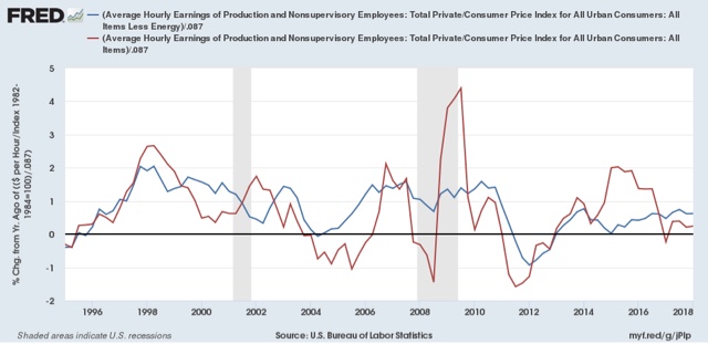
Looking at the same data as YoY% changes is helpful in seeing the change in trend:

With some exceptions, real wages rose about 1.5% a year on average between 1995 and 2010. But since then, they have averaged no better than about half of that, +0.7% a year.
During the entire last 7 year period, real wages leaving aside gas prices have only gone up about +1.4%.
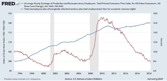
Further, so far it doesn't appear to be a matter of a labor market that isn't tight. In the below graph I have overlaid the U6 broad underemployment rate onto real wage growth adjusted for gas prices.

In both the late 1990s and the beginning of 2005, when real wage growth started to accelerate, U6 was roughly at 9.3%. We arrived at that benchmark in November 2016, without any noticeable acceleration in wage growth in the 18 months since.


