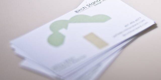
business cards all share a common purpose: market your business while telling people how to contact you. The challenge is coming up with one that achieves both these objectives at a relatively low cost and minimal investment of time. Here are a few tips on how to create a great business card.Make It as Simple as Possible Photographers are creative types, but business cards are there to sell your business as much as they are selling your artistic talent. Your business card probably shouldn't shove half a gallery on the back of the business card. You're undermining yourself if the logo, sample photos or card decorations get in the way of the text's readability. Minimize the potential for printing mistakes and negative customer impressions by making things as simple as possible. Go for a simple font. Then your business card is taken more seriously by some, and your wedding photography business card isn't mistaken for a wedding invitation. Be careful mixing fonts, since they could clash with each other or distract from your photo samples. Choose a relatively simple, stylized logo. This is easier to print, and that will maximize the quality of the print job.Use a Template to Design It One of the best ways to avoid mistakes when designing your business card is to use a template intended for business cards. This will ensure that the text you input is legible when printed on the business card. It provides sizing advice so that your image isn't cut off in the printing process. A good template warns you when you've picked a low resolution image that will look horrible when printed and the font isn't compatible with the printer.It speeds up the design process, since you only have to import your logo image and any other images you're going to put on the business card. Business card templates can be saved. Then ordering another batch of business cards is a simple, straightforward process. If you don't like the design or your contact information has changed, open up the saved file and make changes. You don't have to reinvent the wheel. It also makes it easier to create multiple versions of the same business card, such as when you four different business cards. For example, you could have the same “business” side to each but a different sample image on the back.Don't Forget the Physical Impact of the Card There are several variations of this advice. First, don't go with a cheap card stock. If the business cards look like they just came off your printer, you look like an amateur. Thicker, more solid card stock is a physical indication of quality and care. This decision has practical implications, too. The heavier card stock is less likely to tear as it is put in a wallet and less likely to be damaged if someone gets it wet. It gives you the option to emboss your business card, a stylish design choice that may not affect readability the way a decorative border would. Just don't try to express your creativity by choosing an unusual business card size. A business card that doesn't fit in someone's wallet is far less likely to be kept.

How to Create a Great Business Card
No tags for this post.


